When it comes to email campaigns, your Call-to-Action (CTA) is the single most important element that drives conversions. A clear, action-oriented CTA can boost click-through rates by up to 371%, while personalized CTAs in segmented campaigns generate 50% more clicks. The key? Tailor your CTA to match the reader's intent and keep it concise, focused, and engaging.
Here’s what you’ll find in this guide:
- Welcome Emails: Use CTAs like "Start My Free Trial" or "Claim My Welcome Discount" for high open-rate emails.
- Newsletters: CTAs such as "Read the Full Breakdown" or "Join 10,000+ Readers" grab attention and drive clicks.
- E-commerce: Phrases like "Add to Bag" or "Claim My 20% Off" simplify the buying process.
- Limited-Time Offers: Create urgency with CTAs like "Ends at Midnight" or "Shop the Flash Sale."
- Lead Generation: Use first-person phrasing like "Download My Free Guide" or "Reserve My Spot."
- Webinars: Encourage sign-ups with "Save My Seat" or "Join Live (It's Free)."
- Re-engagement Campaigns: Win back subscribers with CTAs like "See What's New" or "Claim My 20% Discount."
- Feedback Requests: Drive reviews with simple CTAs like "Leave My Review" or "Rate It Now."
- Transactional Emails: Keep it functional with CTAs like "Track My Shipment" or "Reset My Password."
Pro Tip: Stick to one CTA per email, use action verbs, and test designs for both light and dark modes to maximize clicks. A well-crafted CTA transforms your email into a tool for meaningful engagement.
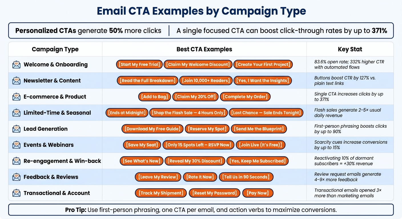
Email CTA Examples by Campaign Type: 70+ Proven CTAs
How to Create Powerful Email CTAs That Actually Work
1. Welcome and Onboarding CTAs
When it comes to conversions, CTAs (calls-to-action) in welcome emails deserve special attention. Why? Because welcome emails boast an impressive 83.6% open rate, far surpassing the 30–40% average for regular campaigns. This makes the CTA in your welcome email one of the most impactful elements you'll ever send. The goal here is straightforward: inspire the reader to take a meaningful action while their interest is at its peak.
"The welcome email is the single highest-performing email you will ever send." - Neal Schaffer, Author and Digital Marketing Coach
A quick tip: swap "Start your free trial" for "Start my free trial" to make the action feel personal. Research shows that first-person phrasing can significantly increase click-through rates. To further ease hesitation, add micro-copy like "No credit card required" right below the button.
Here are 8 examples of effective welcome and onboarding CTAs you can implement today:
- "Create Your First Project" - Supabase used this in April 2026 to guide developers directly into their workflow, skipping any lengthy product pitches.
- "Claim My Welcome Discount" - A personalized CTA tied to an incentive, best placed above the fold for maximum visibility.
- "Start My Free Trial" - A low-barrier alternative to "Sign Up" that emphasizes personal ownership.
- "Complete My Profile" - A subtle nudge encouraging users to take a simple action that unlocks personalized features.
- "Watch the Quick-Start Video" - Ideal for complex products, this CTA offers an easy way to learn without overwhelming the user.
- "Find My First Leads" - Apollo implemented this in April 2026, placing it both above and below their setup checklist for convenience.
- "Keep My Pro Features" - A loss-aversion tactic used in trial-ending emails to emphasize what users might lose if they don't act.
- "Take the Style Quiz" - An interactive CTA that engages users while collecting their preferences for a tailored experience.
Stick to one CTA per email. Automated welcome flows that follow this principle achieve 332% higher click-through rates and 2,361% higher conversion rates than typical scheduled campaigns. Make sure your CTA button is at least 44 pixels tall for easy tapping, and send the email immediately - 74% of consumers expect a prompt response.
Next, we’ll dive into CTAs for newsletters and content promotion, building on the fundamentals covered here.
2. Newsletter and Content Promotion CTAs
Newsletter CTAs have one clear purpose: to get clicks. In today's cluttered inboxes, generic phrases like "Learn More" or "Click Here" simply don't grab attention. Swapping out a plain text link for a clickable button? That can boost click-through rates by an impressive 127%.
The secret to effective CTAs lies in answering the reader's unspoken question: "What’s in it for me?" Cliff Sizemore, Senior Growth Marketing Manager at LocaliQ, puts it perfectly:
"One of my best tips for writing CTAs is to anchor them to clear outcomes."
To make your buttons irresistible, keep the copy short - two to five words is ideal. Start with a strong verb and use first-person phrasing to create a sense of ownership. This small tweak can increase click-through rates by up to 90%.
Here are 8 CTAs you can use to supercharge your newsletters and content promotions:
- "Read the Full Breakdown" - This outcome-focused CTA sets clear expectations for the reader.
- "See What You've Missed" - Perfect for recap-style newsletters, it taps into curiosity.
- "Get the Weekly Templates" - Highlights a specific, recurring benefit that feels rewarding.
- "Join 10,000+ Readers" - Leverages social proof to build trust and credibility.
- "Yes, I Want the Insights" - First-person phrasing makes it feel like a personal decision.
- "Read the 2-Minute Version" - A time-friendly option that appeals to busy readers.
- "Uncover the Full Story" - Sparks curiosity by hinting at valuable information.
- "Dive Into This Week's Issue" - Action-oriented and tailored to fresh, timely content.
For longer newsletters, it’s a good idea to repeat your CTA in the middle and at the end of the email. This ensures you capture readers' attention at multiple points. These strategies help lay the groundwork for creating CTAs that truly resonate in promotional emails.
3. E-commerce and Product Promotion CTAs
When it comes to e-commerce, CTAs (call-to-actions) are all about making the buying process as smooth as possible. A well-crafted CTA can turn casual browsers into paying customers. In fact, using a single, clear CTA can increase clicks by up to 371%. Jacob Sappington, Director of Email Strategy at Homestead Studio, sums it up perfectly:
"There's this thought in the email marketing community: one email, one objective, one CTA."
The most effective e-commerce CTAs eliminate unnecessary steps and reduce hesitation. Phrases like "Add to bag" or "Complete my order" assume the customer is already interested and simply need a nudge to finalize their purchase. Adding a small line of microcopy, such as "Free shipping on orders over $50", can further reassure and encourage action.
Here’s a look at some standout examples of e-commerce CTAs that align with current trends:
- "Claim My 20% Off" - First-person phrasing creates a sense of ownership and personal connection.
- "Add to Bag" - A simple, no-friction prompt that makes the next step feel effortless.
- "Shop Must-Have Dishes" - Specific and benefit-driven, outperforming generic options like "Shop Now."
- "Get It Before It's Gone" - Adds urgency and taps into the fear of missing out (FOMO).
- "Find Your Fit" - A personalized approach that feels relevant to the shopper.
- "Complete My Order" - Perfect for cart abandonment emails, encouraging users to finish their purchase.
- "See What's New This Week" - Sparks curiosity and highlights fresh arrivals.
- "Unlock My Discount" - Action-oriented and exclusive, making the offer feel special.
One final tip: test your CTA buttons in dark mode. Some email clients invert colors, which could make your button hard to see. A quick test ensures your CTA stays clear and clickable.
4. Limited-Time Deals and Seasonal CTAs
When it comes to calls-to-action (CTAs), few things drive results like urgency. Limited-time and seasonal offers tap into that sense of urgency, pushing people to act quickly. A well-crafted CTA with a clear expiration date can be the nudge someone needs to make a decision. The key here is precision - your language should leave no room for hesitation.
"Loss aversion - the pain of missing out - is a stronger motivator than the pleasure of a deal."
CTAs that use specific deadlines, like "Ends at Midnight", tend to perform better than vague ones like "Limited Time Only". Similarly, phrases like "Only 3 Left" create more urgency than "While Supplies Last." Seasonal CTAs work on the same principle: the more tied they are to a specific time or event, the more effective they are.
Here are some examples of limited-time and seasonal CTAs that get results:
- "Claim My 30% Off - Ends at Midnight": This combines a sense of ownership with a clear deadline, encouraging faster clicks.
- "Grab It Before It's Gone": Perfect for low-stock situations where urgency is key.
- "Unlock My Black Friday Price": Tied to a major shopping event, this type of CTA feels personal and timely.
- "Shop the Flash Sale - 4 Hours Only": A precise time frame creates urgency. Flash sales paired with focused CTAs like this can generate 2–5× the usual daily revenue.
- "Get Early Access Before Everyone Else": A VIP-style CTA that rewards loyal customers with exclusivity. Sean Frank, CEO of Ridge, shared: "One of the best performing emails we ever do is like an early invitation to shop the sale."
- "Save My Holiday Deal": Perfect for major shopping seasons, especially when 75% of consumers actively search their inboxes for discount codes during these periods.
- "Last Chance - Sale Ends Tonight": Ideal for the final push in a multi-email campaign. Scarcity-driven CTAs like this often see conversion rates climb from 36% in the first email to 71% by the fifth.
- "Unwrap Your Savings": A festive, holiday-themed CTA that feels fun and specific. You can swap it out for other events, like "Hop to It" for Easter or "Ring In the Savings" for New Year's.
For maximum impact, structure your limited-time campaigns as a three-email sequence: a teaser email 24–48 hours ahead of the promotion, a launch email when the offer starts, and a final "last chance" reminder. This kind of sequence can deliver 3–5× more conversions than a single email blast. These tactics lay the groundwork for even more effective CTA strategies in your lead generation efforts.
5. Lead Generation and Gated Resource CTAs
When it comes to lead generation, the goal is simple: turn curiosity into contact information. Gated content CTAs excel at this by persuading users to exchange their details for something they find worthwhile. Interestingly, the success of these CTAs often hinges on small details, like the phrasing. Research shows that using first-person language - like "Send Me the Guide" instead of "Download Your Guide" - can increase clicks by up to 90%.
"A call to action in emails decides whether the reader will engage with your content or not. It is the bridge between curiosity and conversion." - Himaan Chatterji, B2B SaaS content strategist
Below are eight examples of effective CTAs for lead generation and gated resource emails, each tailored to specific types of content:
- "Download My Free Guide": Perfect for e-books and how-to guides. The word "my" gives readers a sense of ownership even before they click.
- "Reserve My Spot": Great for webinars, especially when paired with scarcity cues like "Only 22 spots left" to create urgency.
- "Get the Templates": Short and benefit-focused, this CTA makes it clear what users will receive, reducing hesitation.
- "Unlock the Full Analysis": Ideal for exclusive reports or research, as "unlock" suggests access to premium, hidden value.
- "See the Results": A low-pressure option for case studies that sparks curiosity without feeling pushy.
- "Start My Free Trial": Highly effective for software or tools, especially when accompanied by reassuring micro-copy like "No credit card required".
- "Claim My Free Checklist": The word "claim" hints at limited availability, subtly encouraging action.
- "Send Me the Blueprint": Works well for process-oriented materials like frameworks or step-by-step guides. First-person phrasing keeps it personal and engaging.
These CTAs focus on clarity and personalization, which are key to converting prospects through gated content. In fact, a single, well-crafted CTA can boost click-through rates by up to 371%. For gated resources, this approach highlights the content's value, ensuring it resonates with your audience and drives higher engagement.
To maximize effectiveness, keep your design clean and focused. Use a single, prominent CTA that communicates value clearly and minimizes friction. For example, adding phrases like "Takes 2 minutes" or "Instant access" can reassure users and encourage action.
sbb-itb-6e7333f
6. Event and Webinar CTAs
Getting someone to commit their time to an event or webinar is no small ask. Unlike a simple click, these CTAs need to be persuasive enough to convince readers to set aside their schedules. Using first-person phrasing like "Save My Seat" and incorporating a well-designed button can make a big difference, increasing click-through rates by up to 90% and 127%, respectively.
"The highest-converting event invitations share five traits: a subject line that names a specific outcome... a first sentence that establishes relevance... a 1–3 line summary... one piece of social proof... and a single, prominent CTA." - Attendir Blog
To effectively secure registrations, event and webinar CTAs need to go beyond generic language. They should be specific, engaging, and tailored to the audience. Below are eight examples of CTAs that have proven to work:
- "Save My Seat": This first-person phrasing gives readers a sense of ownership, making the action feel personal before they even register.
- "Only 15 Spots Left – RSVP Now": Highlighting limited availability creates a sense of urgency, which can increase conversions by up to 15%.
- "Join Live (It's Free)": Simple and no-pressure, this phrasing removes cost-related concerns.
- "Master [Skill] in 60 Minutes": Replace [Skill] with a specific benefit to show exactly what attendees will gain, answering their key question: What’s in it for me?.
- "Get the Replay & Slides": Offering on-demand access appeals to those with scheduling conflicts, potentially expanding your audience by up to 30%.
- "Earn 1.5 CPE Credits": For professionals in fields like finance or law, highlighting credentialed learning opportunities can be a strong motivator.
- "Secure My Spot Before [Date]": Adding a deadline alongside first-person phrasing creates both urgency and a personal connection.
- "Book a Strategy Audit": Perfect for follow-up emails after a webinar, this CTA targets high-intent participants and opens the door for a sales conversation.
These examples show how choosing the right words and emphasizing clear benefits can significantly boost registrations. If your event has a firm deadline, always make the registration cutoff date highly visible to reinforce urgency.
7. Re-engagement and Win-back CTAs
Winning back inactive subscribers is a smart way to boost conversions and maximize revenue. Reactivating even a small portion of dormant subscribers can have a huge impact - bringing just 10% of them back can increase revenue by up to 30%. Plus, when a customer re-engages, their lifetime value can double or even triple. The key is to tailor your call-to-action (CTA) based on how long they've been inactive. For instance, someone who hasn’t engaged in 30 days might need a lighter nudge compared to someone who's been silent for four months.
"Inactive subscribers can be costly or represent untapped revenue. The difference is whether you try to win them back before giving up." - Chase Dimond, Founder
The table below offers a quick guide to matching CTAs with inactivity periods:
| Inactivity Period | CTA Type | Example CTA |
|---|---|---|
| 30–60 Days | Value/Content Reminder | "See What's New" |
| 60–90 Days | Product/Feature Update | "Try the Improved [Feature]" |
| 90–120 Days | High-Incentive/Mystery | "Reveal My 30% Discount" |
| 120+ Days | Sunset/Final Goodbye | "Yes, Keep Me Subscribed" |
Here are some effective re-engagement and win-back CTAs you can incorporate into your campaigns:
- "See What's New": A gentle reminder for subscribers who’ve been inactive for 30–60 days, reintroducing your brand without being too pushy.
- "Try the Improved [Feature]": Highlights updates or improvements to your product, inviting users to check out changes that may solve past issues.
- "Reveal My 30% Discount": A playful, curiosity-driven CTA that frames a discount as a mystery, making it feel more engaging.
- "Claim My 20% Discount": A direct and personalized offer designed to overcome the hesitation of long-term inactivity.
- "Take a 5-Minute Lesson": Perfect for apps or SaaS tools, this CTA reduces commitment barriers by emphasizing quick, low-effort engagement.
- "Shop Bestsellers": Leverages social proof by showcasing popular products, making it easier for lapsed customers to jump back in.
- "Was It Something We Said?": A conversational and self-aware approach that grabs attention with its friendly, lighthearted tone.
- "Yes, Keep Me Subscribed": A straightforward sunset CTA that offers a clear choice, helping you maintain a clean email list.
A great example of this strategy in action comes from VANHA Digital. In 2026, the agency implemented a behavior-triggered win-back email flow for an ecommerce client. The result? The email flow generated 35% of the brand's total revenue, and retention strategies now contribute 25% to 30% of their overall revenue, according to co-founder Theo Van Wyk.
One final tip: Instead of forcing an unsubscribe, consider offering options like "Pause" or "Manage Preferences." Often, subscribers disengage due to email frequency rather than lack of interest. Giving them control over how and when they hear from you can help retain valuable contacts.
Next, we’ll dive into CTAs that focus on gathering customer feedback and reviews to further strengthen your email campaigns.
8. Customer Feedback and Review Request CTAs
Customer reviews play a key role in shopping decisions, with 95% of buyers considering them before making a purchase. Sending a review request email can generate 4–9 times more feedback. To get the best results, make your requests personal and well-timed, ensuring they don’t get overlooked. Timing matters just as much as the message itself.
"A review request isn't a marketing blast; it's the final, crucial step of the customer service experience. Make it frictionless, personal, and respectful of their time." - Ben Salomon, Growth Marketing Manager, Yotpo
Timing your request based on the delivery date - not the purchase date - can significantly improve engagement. This ensures the customer has had enough time to use the product. For example, fashion items might need 5–7 days, electronics 7–10 days, and skincare products 14–21 days before requesting feedback.
Here are eight short and effective CTAs designed to encourage customer feedback and reviews:
- "Leave My Review": Simple and direct, this clear CTA performs better than vague options like "Click Here" by telling customers exactly what to expect.
- "Rate It Now": Perfect for mobile users, this quick, thumb-friendly CTA works especially well for emails opened on smartphones.
- "Help a Fellow Shopper": Positions the review as a way to assist others, which resonates well in community-focused niches like baby products or outdoor gear.
- "Share Your Photo + Earn Points": Combines a request for visual user-generated content (UGC) with a loyalty incentive. Shoppers who engage with customer photos are 161% more likely to convert.
- "How Was the Fit?": By asking a specific question, this CTA encourages customers to provide detailed and useful feedback instead of leaving a generic review.
- "Tell Us in 90 Seconds": Setting a time frame lowers the perceived effort, leading to higher click-through rates.
- "Quick Favor?": Casual and conversational, this CTA works well for local businesses or service-based brands, where a personal tone builds trust.
- "Need Help Instead?": A backup CTA placed in the email footer, redirecting unhappy customers to private support rather than a public review page. This helps safeguard your brand's reputation.
To encourage participation, consider offering loyalty points or a small discount for honest reviews, keeping in line with FTC 2026 compliance rules.
9. Transactional and Account-related CTAs
Transactional emails are some of the most-read messages you’ll send. For example, order confirmation emails boast an average open rate of 65%, and transactional emails, in general, are opened three times more often than marketing emails. This makes them a prime opportunity to engage your audience.
As with other email types, having a clear and actionable CTA is key to driving immediate engagement. Transactional messages might seem routine, but they offer a perfect chance to reinforce the importance of concise, action-oriented CTAs at every touchpoint.
"Transactional emails are viewed 3x more than marketing emails on average. If brands are not ensuring their transactional messaging is on brand and personalized, they are missing a huge opportunity to drive retention and lifetime value." - Noah Rahimzadeh, Director of Partnerships, Malomo
Because these emails are triggered by user actions, recipients are already engaged and ready to take the next step. A well-crafted, single CTA in these emails can increase clicks by up to 371%. To maximize effectiveness, keep the button text short - just two to five words - use a strong action verb, and position the CTA above the fold so it’s immediately visible.
Here are six examples of transactional and account-related CTAs that consistently perform well:
- "Track My Shipment": Provides instant access to delivery updates with clear and straightforward language.
- "Reset My Password": First-person phrasing boosts clicks, and delivering reset emails in under 5 seconds ensures users stay engaged.
- "Pay Now": Urgent and direct, this CTA is critical for resolving failed payments. Well-structured recovery sequences can recover 30–50% of lost revenue from failed transactions.
- "Verify My Email": A staple for account setup and welcome flows, this CTA should be easy to find. Verification emails should arrive within 30 seconds to maintain user interest.
- "Download My Invoice": Specific wording like this reduces hesitation compared to generic terms like "View", making the next step crystal clear.
- "Report Suspicious Activity": A security-focused CTA for login alerts or OTP emails, giving users an easy way to flag unauthorized access.
Conclusion
In this guide, we've covered over 70 specialized CTA examples designed to align with different email campaign goals. A well-crafted CTA can turn an email into a powerful tool for driving conversions. As Shivani Goyal, Content Manager at NVECTA, explains: "The CTA is what transforms your email from a message into a conversion tool." It's clear that there’s no universal formula - what works for a welcome email might not be as effective for cart abandonment or webinar invitations.
Still, some key principles apply across the board: keep it concise (two to five words), start with an action verb, use first-person phrasing when appropriate, and focus on a single, clear next step. Personalized CTAs can lead to 50% more clicks, and emails with one focused CTA often see click-through rates increase by as much as 371% compared to those with multiple competing links. These results only grow as your audience expands.
"The best CTA isn't just about getting the click - it's about starting the next meaningful interaction with your audience." - Samuel Darwin, Founder, Sparkle.io
To make these strategies even easier to implement, leverage tools that simplify the process. For those seeking platforms or agencies to assist with creating, testing, and optimizing CTAs, the Email Service Business Directory is a great resource. It offers a curated list of email marketing platforms, automation tools, and specialized agencies to suit your campaign's unique needs.
FAQs
How do I choose the right CTA for each email type?
The key to crafting the perfect CTA lies in understanding your subscriber's familiarity with your brand. For new contacts, stick to low-pressure options like curiosity-driven prompts - these encourage exploration without overwhelming them. On the other hand, loyal customers are more likely to respond to high-commitment CTAs like "Buy now."
Placement matters, too. Keep simple CTAs above the fold where they’re immediately visible. Save more detailed or complex CTAs for below the fold, where users can engage after absorbing more information. Always ensure your primary CTA focuses on your main objective, while any secondary buttons complement and support that goal.
When should I use first-person CTA copy?
Use first-person CTA copy - like swapping "your" for "my" - to boost click-through rates. This subtle shift helps readers picture themselves taking action, creating a personal connection and a stronger sense of ownership. It’s a simple yet powerful way to make your offer more engaging and drive more clicks. Want more tips for email campaigns? Check out resources like the Email Service Business Directory to fine-tune your strategy.
How can I A/B test CTA buttons effectively?
To run an effective A/B test on CTA buttons, focus on testing just one variable at a time. This could be the button's copy, size, or placement. Start with the copy, as it typically has the biggest influence on click-through rates.
Make sure to define a clear success metric - like the click-through rate - and ensure your sample size is large enough to produce reliable data. For dependable results, aim for 2,000 to 12,000+ recipients per variation in your test.