Dark mode can break an email before a subscriber reads the first line. If I want to cut send risk, I need to check four things before launch: how the email looks in the inbox by assessing email platform compatibility, whether key design parts stay visible, whether the code supports dark mode, and whether fallback versions still hold up when email apps ignore my styles.
Here’s the short version:
- I test the top 3–5 email clients from the last 90 days of open data
- I review both the inbox list view and the opened email
- I check for logo loss, weak text contrast, faded buttons, white image boxes, and broken layout
- I confirm body text hits at least 4.5:1 contrast
- I make sure the email stays under 102KB to avoid Gmail clipping
- I review dark mode CSS, image swaps, and Outlook VML fallbacks
- I block the send if CTAs, legal text, or branding become hard to see
A few clients need extra care. Apple Mail may honor dark-mode CSS. Gmail Android often changes colors on its own. Gmail iOS can fully invert an email. Outlook on Windows is one of the toughest cases because it can invert aggressively and has limited CSS support.
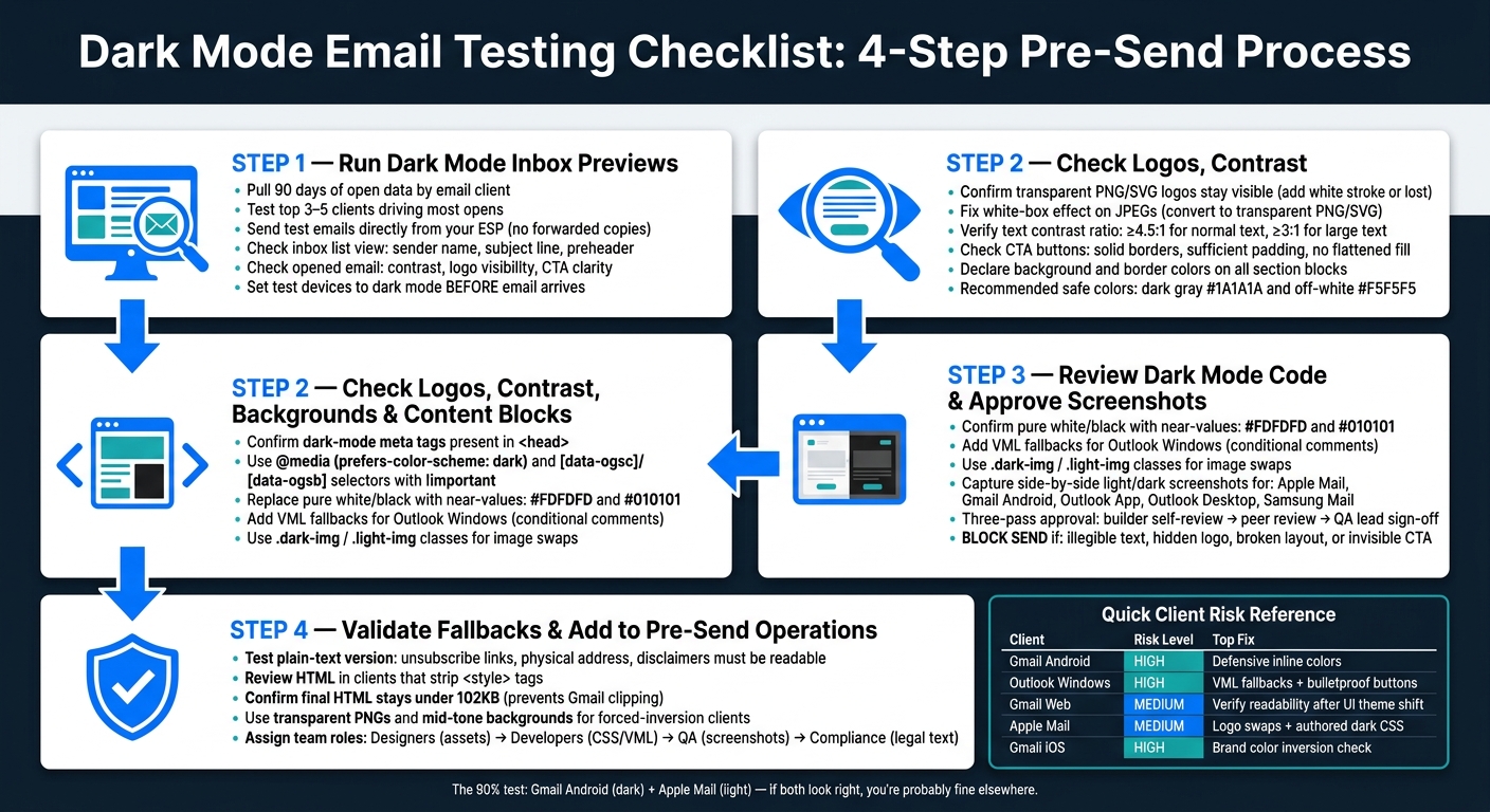
Dark Mode Email Testing Checklist: 4-Step Pre-Send Process
How Dark Mode Affects Your Emails + Render Testing Tips #darkmode #EmailMarketing
sbb-itb-6e7333f
Quick comparison
| Client | Main risk in dark mode | What I check first |
|---|---|---|
| Apple Mail (iOS/macOS) | Partial background changes | Logo swaps, text colors, authored dark styles |
| Gmail Web | Limited email-level dark changes | Readability after UI theme shift |
| Gmail iOS | Full inversion | Brand colors, dark emails turning light |
| Gmail Android | Algorithmic color shifts | CTA visibility, contrast, background changes |
| Outlook App / Outlook.com | Partial inversion | Text, buttons, and image visibility |
| Outlook Windows | Strong inversion + Word rendering | VML buttons, backgrounds, layout hold |
If I can pass those checks, I have a much better shot at sending an email that still looks right in dark mode across the inboxes that matter most.
Step 1: Run Dark Mode Inbox Previews Across Priority Clients
Test dark mode previews before you send. Too many opens now happen in dark mode to skip it.
Start by pulling 90 days of open data by client. Then test the top 3–5 clients that drive most of your opens. Send each test email directly from one of the best email marketing platforms. Don’t rely on forwarded copies, because forwarding can change rendering and tracking. What you see here will give you the baseline for Step 2, especially for logos, contrast, and background treatment.
Check inbox list view and opened email rendering
Review each client in two passes.
First, look at the inbox list view. Check that the sender name, avatar, and subject line are easy to read. Make sure the preheader appears the way you expect. One common problem is the preheader pulling in stray text like "View in browser" or image alt-text. In dark mode list views, those mistakes can jump out even more.
Next, open the email and review the full render. Scan for text-to-background contrast, logo visibility, and CTA button clarity. Also, set your test devices to dark mode before the email arrives. If you switch modes after delivery, you may not see the same result a subscriber would see in real life.
Record client-specific dark mode behavior in a comparison table
Keep a simple shared record of how each priority client behaves in dark mode and which hook your team can use to target it. That way, review doesn’t turn into guesswork.
| Client | Dark Mode Behavior | Relevant dark-mode hook |
|---|---|---|
| Apple Mail (iOS/macOS) | No-change or authored CSS; respects declared styles | @media (prefers-color-scheme: dark) |
| Gmail Web | No email-level change; only the app UI switches | N/A |
| Gmail iOS | Full inversion (aggressive) | Gmail-specific CSS hacks |
| Gmail Android | Partial inversion (algorithmic) | Defensive inline CSS |
| Outlook.com / Outlook App | Partial inversion | [data-ogsc] / [data-ogsb] |
| Outlook Classic (Windows) | Full inversion through the Word rendering engine | MSO / VML / defensive colors |
Use this table to spot which clients need a closer visual check in Step 2. Gmail Android should always make the cut. It’s the highest-risk client and often ignores color-scheme meta tags.
The table also helps you decide how much testing each campaign needs:
- For high-revenue or transactional emails, test the full audience-based matrix.
- For lower-stakes updates, focus on your top 2–3 clients.
"The combination of 'Gmail Android (dark mode)' + 'Apple Mail (light mode)' is the 90% test - if both look right, you're probably fine elsewhere." - AcelleMail
Once you’ve captured the previews and logged each client’s behavior, move to the visual content review in Step 2.
Step 2: Check Logos, Contrast, Backgrounds, and Key Content Blocks
Use the Step 1 previews to inspect the visual layer for the issues dark mode tends to expose first. Think of this as the design pass before you dig into code.
Confirm logos, icons, and images stay visible
Start with transparent PNG and SVG logos. These are often the first assets to vanish after inversion. If a dark logo disappears, add a white stroke or soft glow, or swap in a light version with @media (prefers-color-scheme: dark) or the [data-ogsc] attribute.
Social icons can also get lost against dark UI backgrounds. In many cases, a light or outlined version fixes the problem. Check non-transparent JPEGs too. They often create the white-box effect, where a fixed white background turns into an awkward block inside a dark interface.
Hero images and signature graphics need a close look as well. Watch for haloed edges and text overlays that become hard to read. When you can, use transparent backgrounds and high-contrast text.
| Asset Type | Common Failure | Fix |
|---|---|---|
| Dark logos (PNG/SVG) | Disappear on dark backgrounds | Add white stroke/glow or swap to light variant |
| JPEG images | White-box effect | Convert to transparent PNG or SVG |
| Social icons | Blend into dark UI | Use light or outlined versions |
| Animated GIFs | Pixelated white halos | Use a static fallback or optimized alternative |
| Hero/signature graphics | Haloed edges or unreadable text overlays | Use transparent backgrounds and high-contrast text |
Review text contrast, CTA buttons, and footer readability
Next, check text contrast across every background block. That includes primary text, secondary copy, disclaimers, unsubscribe lines, and footer links. Footer text is easy to miss because it often uses small font sizes or muted gray tones that fade into dark backgrounds.
A good target is a contrast ratio of at least 4.5:1 for normal text and 3:1 for large text, based on WCAG-oriented standards.
CTA buttons need the same level of attention. Inversion can flatten the fill color or wipe out the border, which makes a button look like a plain link. Use solid borders and enough padding so the button still feels like a button at a glance. For color, dark gray (#1A1A1A) and off-white (#F5F5F5) usually work better than pure black or white.
"Design for resilience, not perfection. A conservative palette, clear buttons, and tested assets keep your emails usable and on-brand in dark mode." - BuffSend Team
Check backgrounds, borders, and structural elements
Dividers, table borders, and grid lines often disappear in dark mode when their colors aren't set on purpose. Declare background and border colors for each section block so those structural pieces don't vanish.
Client behavior matters here too. Gmail often shifts colors, while Outlook for Windows can fully invert backgrounds. For Outlook desktop, use VML background-image fallbacks with conditional comments (<!--[if gte mso 9]>).
Use what you find in this visual pass to confirm the dark-mode code paths and screenshot approvals in Step 3.
Step 3: Review Dark Mode Code and Approve Screenshots
The visual pass is done. Now it’s time to check the code that keeps those same results in each inbox.
Review dark mode CSS, inline styles, and HTML fallbacks
Your dark-mode CSS, fallback HTML, and image-swap rules should line up with what you found in Step 2. If a logo disappeared, text lost contrast, or a background broke, you should see a matching fix in the code.
Start with the <head>. Make sure both dark-mode meta tags are there.
Then review your CSS targeting. Use @media (prefers-color-scheme: dark) and [data-ogsc] / [data-ogsb] selectors to override text and background colors. Inside those dark mode blocks, use !important so the rules beat inline styles.
On the HTML side, two checks matter most:
- Classic Outlook desktop on Windows ignores standard CSS background properties, so any background image or bulletproof button needs a VML fallback wrapped in conditional comments.
- Replace pure white and black with near-values like
#FDFDFDand#010101.
For image swaps, use .dark-img and .light-img classes to show or hide assets based on the active theme. Each swap rule should map to the exact asset that failed in Step 2. If you're working with Outlook.com, wrap swapped images in <a> tags. For Samsung Mail, use CSS max-width on images and remove HTML width attributes.
Capture cross-client screenshots and collect approval
After the code review, capture side-by-side light mode and dark mode screenshots for:
- Apple Mail
- Gmail Android
- Outlook App
- Outlook Desktop
- Samsung Mail
Approval should happen in three passes: builder self-review, peer review, and QA lead sign-off before deployment.
Reject anything with illegible text, a hidden logo, a broken layout, or an invisible CTA. If any CTA or legal disclaimer fails the check, block the send.
Use the approved screenshots as the baseline for fallback testing in Step 4.
Step 4: Validate Fallbacks and Add This Checklist to Pre-Send Operations
Test fallback rendering when dark mode support is limited
Use the approved Step 3 screenshots as your baseline for this last fallback pass. Some email clients ignore custom dark-mode CSS, so you need to see how the message holds up when that happens.
Start with the plain-text version and the required legal copy. Unsubscribe links, physical addresses, and required disclaimers still need to be easy to read. Then review the HTML version in clients that strip <style> tags or force their own color changes. Also recheck that the final HTML stays under 102KB.
| Client | Fallback Risk | What to Verify |
|---|---|---|
| Gmail (Web) | High - strips <style> tags |
Background inversion; verify text stays readable after transformation |
| Gmail (Android) | High - aggressive inversion | Text and background colors; use defensive inline colors |
| Outlook (Windows) | High - full inversion via Word engine | VML fallbacks; bulletproof buttons; background rendering |
For clients that force inversion, like Gmail Android and Outlook for Windows, stick with transparent PNGs, mid-tone backgrounds, and safe color pairs. Steer clear of risky combinations like amber backgrounds with dark orange text.
Use a standard approval workflow for every send
Use the Step 1 matrix, Step 2 visual checks, and Step 3 screenshots as the sign-off packet. Give each team a clear lane across these four roles:
- Designers confirm asset transparency and logo visibility
- Developers verify CSS, VML fallbacks, and meta tag implementation
- QA handles cross-client screenshot review
- Compliance signs off on legal text readability
Conclusion: Final pre-send checks that reduce dark mode risk
Run these checks on every send, and you’ll usually get fewer last-minute fixes, faster approvals, and steadier results across the inboxes that matter most.
FAQs
Which email clients should I test first?
Start with the email clients your audience has used most in the last 90 days. Your open data will show you where to focus. Instead of trying to test every possible setup, put your time into the top clients first.
At a minimum, test:
- Gmail (web and mobile app)
- Apple Mail (iOS and macOS)
- Outlook (desktop and web)
Those three usually surface the most common rendering issues.
How do I fix logos that disappear in dark mode?
Use transparent PNGs or SVGs so white boxes don’t show up behind the logo. If a dark logo disappears into a dark background, the most reliable fix is a dual-logo swap with a media query that shows a light version in dark mode.
You can also put the logo inside a container with a solid background, or use a two-tone logo that stays visible on both light and dark backgrounds.
What should I do if a client ignores dark mode CSS?
Rely on safe coding patterns and standard fallbacks to keep your email readable.
- Use transparent images like PNGs or SVGs so logos and icons don't end up with awkward white boxes around them.
- Skip hard-coded white backgrounds and black text, since that can trigger auto-inversion in dark mode.
- Use inline CSS, and test your dark-mode emails to make sure the main content stays easy to read.