A 99% delivery rate can still hide a bad inbox problem. If inbox placement drops, more of your mail goes to spam even though your platform says it was delivered.
If I were checking email performance at scale, I’d watch these 7 benchmarks first:
- Inbox placement - how much mail hits the inbox, not spam
- Bounce rate - list quality stress
- Spam complaints - early sign people do not want the mail
- Deferrals - temporary slowdowns from mailbox providers
- Throttling - provider rate limits
- Block rate - hard rejections
- Engagement decline - falling clicks, replies, and rising unsubscribes
A few numbers stand out right away:
- Global inbox placement averages about 83.5%
- Bounce rate should stay under 2%
- Spam complaints should stay under 0.1%, with 0.3% as the line you do not want to cross
- Blocks should stay under 1%
- B2B lists decayed by about 23% in 2026
- If you send 5,000+ emails per day, SPF, DKIM, and DMARC are now table stakes
Here’s the short version: as volume grows, complaints and bounces often go bad first, then deferrals and throttling show up, then inbox placement falls, and later blocks and weak engagement follow. That means I would not compare email platforms on delivery rate alone. I’d compare them on visibility, control, and recovery across all seven benchmarks.
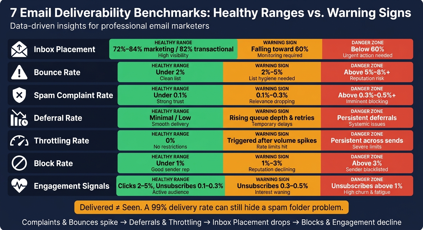
7 Email Deliverability Benchmarks: Healthy Ranges vs. Warning Signs
Email Marketing Benchmarks: Are Your Metrics Actually Good?
sbb-itb-6e7333f
Quick comparison
| Benchmark | Healthy range | Warning sign |
|---|---|---|
| Inbox placement | 72% to 84% for marketing, 82% median for transactional | Falling toward 60% or lower |
| Bounce rate | Under 2% | Above 5% |
| Spam complaint rate | Under 0.1% | Above 0.3% |
| Deferrals | Low | Queue depth and retries climb |
| Throttling | 0% | Volume slows after spikes |
| Block rate | Under 1% | Above 1% to 3% |
| Engagement | Stable clicks, replies, unsubscribes | Clicks fall, unsubscribes climb |
If you want the simplest takeaway, it’s this: delivered is not the same as seen. And once send volume climbs, that gap can cost you inbox reach, revenue, and sender reputation fast.
How Higher Volume Affects Deliverability
At higher volume, every flaw in your sending program hits harder - and it hits faster. A complaint rate that seems manageable at 1,000 sends can turn into a serious issue at 1,000,000, pushing you past the 0.3% complaint threshold that triggers immediate filtering.
It also helps to separate two terms people often lump together. Delivered means the receiving server accepted the message. Inbox placement means the email made it into a folder the recipient can actually see. That gap is where money slips away. On a 100,000-email campaign, weak inbox placement can put about $1,815 in campaign revenue and as much as $60,225 in abandoned-cart revenue at risk.
The same pattern shows up with bounces and complaints. Bounce spikes above 5% or complaint rates above 0.5% can trigger throttling, where ISPs slow delivery or queue messages for later. Once complaints climb, deferrals and throttling usually come next.
Higher volume also speeds up list fatigue. Send more often, and engagement tends to fall. ISPs read that drop as a sign that people no longer want the mail. When that happens, low-engagement filtering can move a sender from Primary to Spam, even if the subscriber did opt in.
In B2B, list decay makes the problem worse. Email lists declined by about 23% in 2026 because of job changes and domain expirations. That means a list that looked fine a few months ago can start dragging down results fast.
For programs sending more than 50,000 to 100,000 messages per month, dedicated IPs are usually needed to isolate reputation. And if you're deciding what to track first, start with inbox placement rate.
1. Inbox Placement Rate
Inbox placement is usually the first thing to drop when send volume goes up. It measures how much of your mail reaches the inbox - not the spam folder.
The global average inbox placement rate is 83.5%. But that figure changes a lot based on the kind of email you send. Transactional email performs best, with a median of 82% and a top quartile of 91%. Marketing email falls to a 72% median, and cold outbound sits slightly lower at 71%.
That spread matters. Only 35% to 36% of programs hit 86% to 95% inbox placement, while 11% report that fewer than half of their emails reach the primary inbox. Once volume climbs, the gap tends to get worse fast.
| Workload Type | Median Inbox Placement | Top Quartile |
|---|---|---|
| Transactional | 82% | 91% |
| Notification | 78% | 87% |
| Marketing | 72% | 84% |
| Cold Outbound | 71% | 78% |
Source: PowerMTA Providers 2026 Trial Data
ISPs treat sudden jumps in volume like a warning sign. The usual response is throttling, deferrals, or direct spam-folder placement.
A steady 4-6 week warm-up plan helps limit that risk. Start with 50-100 messages per day sent to your most engaged subscribers, then increase volume step by step over the following weeks. On top of that, make sure SPF, DKIM, and DMARC are fully set up. When those are in place, inbox placement can move above 90%. Miss DMARC alignment, though, and the drop can be steep - from 82% to 54% on Gmail, a loss of 28 points.
To keep an eye on reputation before things slide, use Google Postmaster Tools and Microsoft SNDS.
Next, bounce rate shows whether higher volume is putting pressure on list quality or sender reputation.
2. Bounce Rate
A bounce rate under 2% is healthy. The best B2B teams often stay below 0.5%. Once volume starts to climb, bounce rate is usually one of the first signs that list quality is getting worse. And at higher volume, even small increases can stack up fast.
Volume spikes tend to expose list issues right away. Cold-imported lists can lead to 10%–20%+ bounce spikes. That kind of one-time cleanup hurts less than letting bounce rates stay high over time.
The table below shows how mailbox providers usually react at each level:
| Bounce Rate | Status | What Happens |
|---|---|---|
| Under 2% | Healthy | Stable reputation |
| 2%–5% | Watch Zone | Check list sources |
| 5%–8% | Concerning | Throttling may start |
| Above 8% | Critical | Filtering or rejection |
Hard bounces point to invalid addresses or typos, so they need to be suppressed across every tool. Soft bounces are temporary, but if the same addresses keep soft bouncing, treat them like hard bounces.
When you compare platforms, look at:
- Real-time validation
- Cross-tool suppression
- Bounce alerts
- Quarterly list hygiene for B2B teams
Next, complaint rate shows when recipients react badly even if messages still get delivered.
3. Spam Complaint Rate
After bounce rate, complaint rate is one of the fastest signs that people no longer want your email. Keep it under 0.1% and you're in great shape. A rate of 0.1%–0.3% is still acceptable for well-managed campaigns, but there isn't much room for error.
Once you pass 0.3%, providers often start handling later sends more strictly. If your rate stays above 0.5%, you can run into throttling, filtering, and, over time, blocking. Getting back to normal can take 30–60 days of better performance.
This can happen fast at scale. One poorly targeted campaign can push complaints past the limit within hours. And as send volume goes up, list quality and engagement matter more. If recipients don't recognize the sender, they're more likely to hit the spam button. That's a bigger problem than an unsubscribe because a complaint does more damage to sender reputation.
Here's how complaint rates usually line up with provider behavior:
| Rate Range | Status | ISP/Platform Action |
|---|---|---|
| < 0.1% | Excellent | Strong inbox placement; high sender trust |
| 0.1%–0.3% | Acceptable | Normal monitoring; standard filtering applies |
| 0.3%–0.5% | At Risk | Stricter handling on later sends |
| > 0.5% | Critical | Throttling, filtering, progressive reputation damage, and eventual blocking |
At scale, track Google Postmaster Tools, Microsoft SNDS, feedback-loop support, one-click unsubscribe headers, and automated pause triggers.
Next, deferral rate shows when providers delay mail instead of accepting it outright.
4. Deferral Rate
A deferral is a temporary SMTP 4xx rejection. It’s not the same as a hard bounce. The key word here is temporary. But when deferrals pile up, they get expensive fast. At higher send volume, they’re often the first clue that mailbox providers are starting to slow down your mail.
If you handle them the right way, deferrals should remain temporary and low-risk. A good platform needs to tell 4xx and 5xx responses apart and retry deferred mail with exponential backoff. Watch for volume spikes and longer delivery times. Rising queue depth or a higher retry count is often your early warning sign. For non-transactional mail, retry deferred messages for 72 to 120 hours before marking them undeliverable. When deferrals stick around, rate limiting is usually the cause. It also helps to split transactional and marketing sends across different subdomains so one stream doesn’t drag down the other.
| Deferral Signal | What It Means | Recommended Action |
|---|---|---|
| Rising queue depth | ISP is slowing acceptance | Lower concurrency; extend retry intervals |
| High retry count per message | Ongoing rate limiting | Pause non-critical sends; check reputation tools |
| Temporary failures only | Temporary issue, not a hard failure | Honor SMTP semantics; do not suppress recipients |
| Volume spike + deferral surge | ISP flagging inconsistent patterns | Reduce send rate; segment by engagement |
If deferrals keep rising, check throttling rate next.
5. Throttling Rate
Throttling happens when a mailbox provider slows delivery instead of fully accepting or rejecting your email. In plain terms, the provider is telling you to slow down.
Even a small amount of throttling should get your attention. As send volume grows, throttling is often the first clear sign that you're pushing past what the provider will tolerate. At scale, it usually shows up after deferrals and before hard blocks.
A sudden jump from 100 emails to 10,000 in a single night can trigger provider rate limits. Missing SPF, DKIM, or DMARC also makes throttling more likely, no matter how much mail you send. Google Postmaster Tools can show delivery errors and reputation drops tied to throttling events, while Microsoft SNDS gives you per-IP complaint data.
On the platform side, look closely at rate limiting, queue management, domain rotation, and reporting. Separate subdomains matter here. If one mail stream gets throttled, you don't want it dragging down everything else. New infrastructure also needs a warm-up period before you increase concurrency.
When you're comparing platforms, the useful question is simple: How well does this system prevent, spot, and recover from throttling?
Focus on:
- Pacing controls
- Retry logic
- Domain isolation
- Reputation visibility
| Throttling Signal | Likely Cause | Recommended Action |
|---|---|---|
| Deferrals spike after a volume jump | Inconsistent send pattern; pacing controls absent | Reduce send rate; evaluate platform pacing tools |
| Throttling persists across sends | Ongoing rate limiting by provider | Split volume across subdomains; adjust retry intervals |
| Complaint rate above 0.3% | Approaching Gmail/Yahoo ceiling | Suppress unengaged contacts; audit list hygiene |
| Bounce rate reaches 5%–8% | ISP treating sender as risky | Pause sends; clean the list before resuming |
6. Block Rate
A block is a permanent rejection. The server returns a 5xx SMTP error and drops the message. You can track block rate through permanent rejection codes and spikes in hard bounces.
A healthy block rate stays under 1%. 1% to 3% is the warning zone, and anything above 3% is danger territory. At higher send volume, even small reputation issues can turn into direct rejections. Sharp jumps in volume - like going from 100 emails a week to 10,000 overnight - can look suspicious to mailbox providers. Microsoft is also stricter here. Senders pushing 5,000 or more messages per day must meet strict authentication rules, and mail that misses the mark can come back with rejection codes such as 550 5.7.515.
Use Google Postmaster Tools and Microsoft SNDS to catch rejection spikes early. If you see a block spike, pause non-critical marketing sends right away and throttle transactional concurrency to protect IP reputation. On the platform side, the big priorities are:
- Subdomain isolation
- Alerts when hard-bounce rates double within 30 minutes
- A recovery protocol that pauses risky sends and rewams volume gradually
High block rates usually show up after weaker reputation signals. In many cases, falling engagement is the first sign.
| Block Rate Level | Status | Outcome |
|---|---|---|
| Under 1% | Healthy | Stable delivery |
| 1%–3% | Warning | Increased filtering risk |
| Above 3% | Danger | Active rejection or blocking |
If blocks stay low but results start to slip, watch engagement next.
7. Engagement Decline
Engagement decline is often the first soft sign of fatigue - and one of the most harmful. It doesn't show up like a hard bounce or a block, so it's easy to miss. But over time, it can chip away at sender reputation and make future mail less likely to land in the inbox. That's why engagement controls are a test of your email marketing platform, not just a campaign KPI.
For marketing email, focus on open rates adjusted for Apple Mail Privacy Protection, click rate, and unsubscribe rate. Open data is less dependable because Apple Mail Privacy Protection can inflate it. Click rates in the 2%-5% range are generally healthy, and unsubscribe rates should stay around 0.1%-0.3%. Once unsubscribes move above 0.5%, it's a warning sign. Above 1%, you're in the danger zone.
Volume spikes can make this go south fast. If you send to inactive contacts in large batches, you create graymail - messages that get delivered but ignored. ISPs read that pattern as a sign the mail isn't wanted, and later campaigns may end up in spam or lower-visibility tabs and folders. That problem isn't niche either: 51% of email professionals point to engagement decay as a main deliverability issue.
At scale, the answer is operational. Segment by recency, limit frequency, and sunset inactive contacts. The signals that matter most are not open rates. They're click rates, unsubscribe trends, and reply rates. On the mailbox-provider side, Google Postmaster Tools shows domain reputation and spam rates, while Microsoft SNDS shows IP-level reputation and complaint data.
A simple structure looks like this:
- Active: 0-90 days
- Lapsed: 90-180 days
- Dormant: 180+ days
Suppress contacts who haven't engaged in 180+ days. That kind of control helps keep engagement signals in line as send volume grows.
| Metric | Healthy | Warning | Danger |
|---|---|---|---|
| Open rate (marketing, MPP-adjusted) | 22-32% | Watch for sustained declines | Steady drop |
| Click rate (marketing) | 2-5% | Watch for sustained declines | Steady drop |
| Unsubscribe rate (marketing) | 0.1-0.3% | 0.3-0.5% | Above 1% |
These signals matter most when you're comparing automation, segmentation, and suppression tools.
What to Compare When Evaluating Email Platforms
Use these controls to check whether a platform can track and manage the seven benchmarks above.
Inbox placement: Don’t stop at “delivered” counts. That number can hide a lot. You want folder-level inbox placement data, so you can see whether messages land in the primary inbox, promotions, spam, or somewhere else. Also confirm native integrations with Google Postmaster Tools and Microsoft SNDS.
Bounce handling: A solid platform should show raw SMTP codes, not vague labels. It should also treat temporary and permanent failures differently - routing 4xx responses to retry and 5xx responses to suppression.
Complaint handling: Check for automated suppression and complaint-loop support at the 0.3% threshold. If that process is manual, things can go sideways fast.
Deferrals and throttling: Look for exponential backoff, configurable retry windows, and provider-specific pacing controls. This is one of those areas where small control settings can make a big difference.
Blocks and engagement: Compare real-time RBL monitoring and automated recency-based suppression too. If a platform can’t help you spot blocks or trim out stale contacts, recovery gets a lot harder.
Use the comparison table below to score each platform on visibility, control, and recovery.
For vendor shortlists, use the Email Service Business Directory to compare throttling, retry, and monitoring features.
Benchmark Ranges and Platform Capabilities: Comparison Table
The table below turns the seven benchmarks into buying criteria. One key point up front: use MPP-adjusted open rates, not raw opens. Raw open data is inflated, so it can give you a false read on performance.
Use these ranges to judge both current results and the controls a platform needs once sending volume starts to climb.
| Benchmark | Healthy Range | During Volume Spikes | Helpful Platform Features |
|---|---|---|---|
| Inbox Placement | 72%–84% for marketing Gmail Primary; 82% median for transactional | Can drop below 60% when sender reputation is weak or unproven | Seed-list testing; placement testing |
| Bounce Rate | < 2% | Cold-imported lists can jump to 10%–20% on the first send; acceptable only as a one-time cleanup event | Real-time validation API; hard-bounce suppression |
| Spam Complaint Rate | < 0.1% target; < 0.3% hard ceiling | Going above 0.3% can trigger immediate filtering; rates above 0.5% over time lead to progressive blocking | One-click unsubscribe headers; complaint monitoring |
| Deferral Rate | Minimal | Rises when providers queue suspicious volume surges | Exponential backoff; provider-specific pacing |
| Throttling Rate | 0% | Triggered when bounce rates hit 5%–8% or complaints go above 0.5% | Dedicated IP pools; automated IP warming |
| Block Rate | 0% | Sustained high complaints or bounces can produce 550 rejection errors |
Real-time blacklist monitoring; DMARC at p=reject |
| Engagement Signals | No sustained drop in open, click, or reply trends | About 35% of senders see declines when frequency rises too fast | Behavioral segmentation; sunset policies |
These metrics usually don’t fail one at a time. When volume starts to hurt deliverability, the pattern is often pretty clear: a complaint or bounce spike comes first, then deferrals and throttling, then spam-folder placement, and finally blocks.
Provider behavior also varies more than many teams expect. On B2B lists, it makes sense to benchmark Outlook on its own. It runs at about 74% inbox placement versus 82% for Gmail, and its filters are stricter.
Conclusion
As send volume goes up, these seven metrics tend to move together. A 98% delivery rate doesn't tell you whether messages reached the inbox. It also doesn't tell you much about bounces, complaints, deferrals, throttling, blocks, or engagement. The pattern is pretty consistent: bounce and complaint spikes show up first, then deferrals and throttling, then inbox placement drops, and engagement slips because fewer people even see the email.
When you compare platforms, buy based on visibility, controls, and recovery speed - not delivery rate alone. Ask a simple set of questions: How clearly does the platform show all seven benchmarks? How fast can your team spot a problem? What can you do inside the tool when volume spikes start pushing those numbers the wrong way?
Platforms with real-time metric visibility give you a much clearer view than tools that only report "sent vs. delivered" totals. That's why these seven benchmarks are a better way to compare providers side by side.
Use the Email Service Business Directory to compare providers by deliverability and automation features.
FAQs
Why isn’t delivery rate enough?
Delivery rate tells you only one thing: the receiving server accepted your email. It does not tell you whether the message made it to the user’s inbox.
That gap matters more than most teams think. You can post a high delivery rate and still have emails sent to spam, promotions, or other low-visibility folders where people never see them.
Delivery rate also leaves out the problems that shape inbox placement, including spam complaints, bounces, and missing authentication. So if you use this metric by itself, it can mask the reason campaigns aren’t reaching the primary inbox or driving conversions.
Which metric usually fails first as volume grows?
As email volume goes up, bounce rate is often the first metric to break - and the first one inbox providers look at closely.
Once bounce rate moves above 2%, you’re in risky territory. ISPs may start throttling delivery, and that usually signals list-quality problems or old contact data before other metrics start slipping.
When do I need a dedicated IP?
A dedicated IP usually makes sense once you’re sending a steady 50,000 to 100,000 emails per month. At that level, you get full control over your sending reputation instead of sharing it with other senders.
If you’re below that range, a well-run shared IP pool is often the safer and more effective choice.