Emails are now opened on mobile devices 60% of the time. If your marketing emails aren’t mobile-friendly, you risk losing over half your audience. Drag-and-drop email builders solve this problem by allowing you to create responsive, mobile-ready emails without writing code.
Here’s what you need to know:
- Why mobile optimization matters: Poor mobile designs lead to deletions, unsubscribes, and lost engagement.
- How drag-and-drop builders help: They simplify email creation, save time (up to 3x faster), and ensure emails display perfectly on any screen.
- Top email marketing platforms for mobile optimization:
Key takeaway: Mobile-friendly emails are essential for engagement. Choose a builder based on your needs - whether it’s simplicity, flexibility, or advanced features.
How To Use The Drag And Drop Editor In Mailchimp (Easy Tutorial 2026)
sbb-itb-6e7333f
Best Drag-and-Drop Email Builders for Mobile Optimization
Here’s a look at three email builders that excel at delivering mobile-friendly templates, catering to both beginners and advanced users.
Mailchimp
Mailchimp is a great choice for those new to email marketing. Its drag-and-drop editor integrates seamlessly with Mailchimp’s broader marketing suite. Features like the Content Studio, which stores brand assets, and the Creative Assistant, which generates design suggestions based on your brand, make it especially beginner-friendly.
"Mailchimp's drag-and-drop editor is the one most beginners encounter first... but finding specific settings requires navigating multiple menu layers." - Ben Askren, Author
For teams already using Mailchimp’s tools, the convenience of integration often outweighs occasional navigation challenges.
| Pros | Cons |
|---|---|
| Beginner-friendly with tutorials | Complex menus may frustrate advanced users |
| Affordable starting price at $13/month | Pricing escalates quickly with contact growth |
| Strong integration with Mailchimp tools | Limited advanced customization options |
| Free tier for up to 500 contacts | Editor smoothness rated 3/5 compared to competitors |
Next, let’s look at an option built for flexibility and integration.
Unlayer

Unlayer shines as an embeddable solution, making it a go-to for SaaS platforms needing a professional email builder. Its standalone version offers a user-friendly interface often praised for its simplicity - "so easy even kids can use it".
The platform includes dynamic content blocks and device-specific previews, so you can see exactly how your email will look on various screen sizes. Unlayer’s HTML output is rated 5/5, ensuring consistent performance across email clients.
| Pros | Cons |
|---|---|
| Embeddable SDK for custom use cases | Advanced features reserved for paid plans |
| Free standalone version available | Smaller template library (~100) compared to others |
| High-quality HTML output (5/5 rating) | Limited to 26 ESP integrations vs. 80+ for Stripo |
| Intuitive interface with high user ratings | Smart elements rated 3/5 |
Finally, Stripo offers unmatched flexibility for advanced users.
Stripo
Stripo is ideal for teams that need extensive customization and technical depth. It’s the only major builder offering native AMP for Email support, enabling interactive features like carousels and accordions directly in mobile Gmail inboxes. Its dual-editing mode lets users toggle between a drag-and-drop editor and an HTML editor, with both views staying perfectly aligned.
With over 1,500 templates - the largest library in the industry - and integration with more than 80 Email Service Providers, Stripo handles everything from simple campaigns to complex enterprise needs. The platform’s AI tools can cut first-draft creation time by 60–70%, making it a favorite among 65% of Fortune 100 companies.
Stripo also includes built-in testing via Email on Acid, allowing previews across 98 mobile and desktop clients. Smart Modules enable users to save mobile-optimized headers and footers, which sync across all templates, saving time on updates.
| Pros | Cons |
|---|---|
| Largest template library (1,500+) | Advanced features require paid plans |
| Native AMP support for interactive elements | Learning curve steeper than Mailchimp |
| Integrates with 80+ ESPs | Free tier limited to 5 exports/month |
| AI tools reduce draft time by 60–70% | Team plans start at $45/month |
| Real-time collaboration for teams | - |
| High ratings: 4.8/5 on G2, 4.9/5 on Capterra | - |
"Stripo earns the top position by combining the most flexible drag-and-drop editor with the deepest content block library, the highest HTML output quality, and the largest template collection in the industry." - Ben Askren, Author
Each of these tools delivers mobile-friendly designs and high-quality HTML output, making them essential for efficient email campaign creation.
Comparison of Drag-and-Drop Email Builders
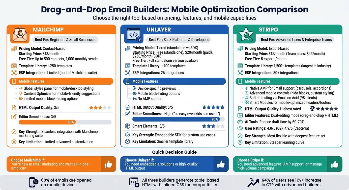
Comparison of Top 3 Drag-and-Drop Email Builders for Mobile Optimization
Let’s break down mobile features, pricing, and usage limits for three popular email builders.
Stripo takes a different pricing approach by charging per export rather than by contact count, starting at $15/month. Its free tier includes 5 exports per month. Stripo stands out for its native AMP for Email support, enabling interactive features like carousels and accordions in mobile Gmail. It integrates with over 80 ESPs and offers built-in testing through Email on Acid, which previews emails across 98 mobile and desktop clients. With over 1,500 templates and advanced mobile controls (like hiding specific blocks on mobile), Stripo is ideal for teams managing high-volume campaigns.
Unlayer provides a free standalone version, with paid plans starting at $20/month and SDK-focused plans beginning at $250/month. While it includes device previews and mobile block-hiding options, it lacks AMP support. Its HTML output quality is rated 5/5, ensuring reliable rendering across email clients.
Mailchimp uses a contact-based pricing model, beginning at $13/month. Its free tier supports up to 500 contacts and 1,000 monthly sends. The platform features a global styles panel for separate mobile and desktop styling, and its Content Optimizer suggests mobile-friendly improvements. However, Mailchimp offers limited options for hiding blocks on mobile, and its template library, with around 250 templates, is far smaller than Stripo's. For businesses already using Mailchimp's suite of marketing tools, the seamless integration often outweighs these drawbacks.
All three builders generate table-based HTML with inlined CSS, ensuring compatibility with older mobile email clients and Outlook. Choosing the right builder depends on your priorities: advanced interactivity (Stripo), embeddable flexibility (Unlayer), or the convenience of an all-in-one platform (Mailchimp). This comparison sets the stage for identifying which features match your business needs.
How to Choose the Right Email Builder for Your Business
Choosing the right email builder boils down to three main considerations: the size of your business, your budget, and the specific mobile features you require. For smaller businesses, affordability and simplicity are key, while larger teams often need scalable platforms with collaboration tools. For example, Chamaileon costs around $4,000 per year, while Campaign Monitor offers similar scalability options.
Budget is a critical factor, and pricing models vary. Some platforms, like Mailchimp, charge based on the number of contacts, while others, such as Stripo, use flat-rate or export-based pricing (starting at $15 per month). Free tiers can be a good starting point for those with smaller email lists - typically up to 500–1,000 contacts - but these limits can quickly become restrictive as your business grows. When comparing costs, also consider whether the builder integrates seamlessly with your current CRM or e-commerce tools, as switching platforms can lead to additional expenses. Beyond budget, mobile-specific features are equally important.
Why Mobile Optimization Matters
With around 60% of emails being opened on mobile devices, it's crucial that your email builder supports features tailored to mobile rendering. Before committing, test the platform by exporting a sample email to see how it performs. Ideally, it should use table-based HTML and inlined CSS to ensure consistent display across both mobile apps and desktop clients like Outlook. The best tools also allow you to customize mobile-specific settings, such as font sizes, padding, and alignment, independently of the desktop version.
Key Features for Mobile Optimization
Once you’ve aligned your budget and business needs, focus on mobile-specific features to enhance user experience and engagement. Here are some must-have capabilities:
- Responsive previews: These show how your email will look across various devices and email clients. Tools like Stripo, which integrates with Email on Acid, let you preview formatting in real time, helping you avoid display issues.
- Device-specific visibility controls: This feature allows you to hide or show certain content blocks depending on whether the email is viewed on mobile or desktop, simplifying layouts for smaller screens.
- Column stacking and clean HTML: Multi-column layouts should stack predictably on mobile devices. Ensure the builder exports table-based HTML with inlined CSS for compatibility across email clients.
- AMP for Email support: For advanced teams, AMP features like carousels or accordions can add interactive elements directly within mobile Gmail.
Using the Email Service Business Directory for Comparison
The Email Service Business Directory can simplify your decision-making process by consolidating key information about mobile and pricing features. Instead of visiting multiple websites, you can compare platforms based on critical mobile design factors like editor usability, block flexibility, and HTML output quality.
For example, the directory highlights builders offering mobile-specific controls, such as adjustable font sizes (minimum 16px for readability), customizable spacing, and options to hide content blocks on mobile. It also helps verify integration compatibility with your existing email service provider. Stripo, for instance, supports over 80 direct integrations, while Beefree offers 26. Additionally, you can filter platforms by features like AMP-powered carousels, countdown timers, and CSS-animated buttons to boost mobile engagement.
Conclusion
Mobile optimization has become a necessity for successful email marketing. With 60% of emails opened on mobile devices compared to just 10% on desktops, ensuring your campaigns look flawless on smaller screens is non-negotiable. Thankfully, drag-and-drop email builders simplify this process by generating clean, responsive HTML that works seamlessly across devices and email clients.
The right email builder can make a noticeable impact. Advanced tools not only streamline your workflow but can also boost performance metrics. For instance, 64% of users reported an 11% or higher increase in click-through rates after switching to more sophisticated builders.
When choosing a platform, prioritize those with strong mobile-specific features. Look for options offering independent styling controls, device visibility settings, real-time previews, and export capabilities for table-based HTML with inlined CSS. Don’t forget to check integration compatibility with your email service provider - smooth exports can save time and prevent formatting issues.
To simplify your search, the Email Service Business Directory provides a centralized resource for comparing mobile features, pricing, and ESP integrations. Instead of toggling between countless websites, you can evaluate builders based on critical features like template libraries, collaboration tools, and AMP support, all tailored to your business needs.
If you’re unsure where to start, try free tiers or trials to find the most user-friendly option for your team. But remember - an easy-to-use editor is only as good as the HTML it produces. As Ben Askren from Vallkatesearch aptly states:
"The visual editor is the interface - the HTML output is the product".
FAQs
What makes an email template truly mobile-friendly?
A mobile-friendly email template is designed to automatically adjust to fit smaller screens. This means the layout is responsive, the text remains easy to read, and all elements are appropriately sized and arranged for mobile devices - without requiring any extra work from the recipient. Key features include flexible layouts, legible fonts, and buttons that are easy to tap.
How can I test my email on different phones and inbox apps before sending?
You can use the preview and testing features in many drag-and-drop email builders to see how your email looks across various phones and inbox apps. These tools help ensure your email is mobile-friendly by showing how it appears on different devices and email clients. Some even include device previews that simulate various screen sizes, making it easier to spot and fix layout problems before hitting "send."
What mobile features are most important when choosing a drag-and-drop email builder?
When crafting emails, it's essential to focus on key features like mobile responsiveness, scalable images, and a mobile-friendly layout. These elements ensure that your emails adapt effortlessly to different screen sizes, making them easy to read and interact with on any device. By prioritizing these aspects, you can deliver emails that are both visually appealing and functional, no matter where they're viewed.