If your email unsubscribe rate is under 0.2%, you're usually in a good spot. Around 0.2% to 0.5% points to fit or frequency issues, and above 0.5% often means the gap between audience expectations and your emails is too big.
Here’s the short version:
- I’d benchmark unsubscribe rate with this formula: (Unique Unsubscribes ÷ Delivered Emails) × 100
- The 2026 cross-industry average is 0.11%
- Transactional emails often stay below 0.05%
- Opt-in marketing emails often land between 0.1% and 0.3%
- Cold outbound should be judged on its own, with rates often around 0.5% to 1.5%
- 43% of subscribers leave because brands email too often
- List decay is still a big issue, with email lists shrinking by about 22% per year
- Unsubscribe trends can hint at inbox placement trouble before bigger email problems show up
What this tells me is simple: unsubscribe rate is no longer a side metric. It helps me judge message fit, list health, send frequency, and likely retention risk - all in one number.
A few benchmarks stand out. Industries like Wellness & Fitness (0.26%), Creative Services & Agency (0.25%), and IT/Tech/Software (0.23%) run higher than the average. On the low end, Nonprofit and Telecommunications sit near 0.10%. That doesn’t make one program better than another. It just shows that context matters.
I’d also avoid reading this metric in isolation. When unsubscribes move up at the same time as complaints, inactivity, or delete-without-reading behavior, that’s often a sign your list is getting tired. And since automated emails can drive 37% of email-generated sales from just 2% of send volume, losing subscribers from those flows can hit future revenue fast.
So the main takeaway is straightforward: use the right formula, compare against the right send type, watch for spikes by segment, and treat unsubscribes as an early warning sign - not just a cleanup metric.
How Can You Master Email Marketing Metrics? | Email Metrics
sbb-itb-6e7333f
How unsubscribe rate is defined and measured
Before you compare unsubscribe rates, make sure you're using the same denominator as the benchmark. Even a small change here can shift the number. And that choice affects every benchmark you look at next.
Campaign unsubscribe rate vs. list churn
The standard formula for campaign unsubscribe rate is (Unique Unsubscribes ÷ Delivered Emails) × 100. In plain English, use delivered emails - sent minus bounces. That denominator is the standard because it counts only people who actually had a chance to receive the email.
List churn, sometimes called list decay, measures something else. It looks at subscriber loss over a longer period and includes unsubscribes, hard bounces, and inactive subscribers. So the difference is pretty simple:
- Campaign unsubscribe rate shows the direct response to one send
- List churn shows how the audience shrinks over time
Email lists decay on their own, too. On average, lists shrink by about 22% per year.
How reporting differs across email platforms
Not every email marketing platform reports this the same way. Some use sent emails instead of delivered emails, which can make unsubscribe rates look lower because bounced messages are still in the count. If that's how your platform works, check the math and recalculate with delivered emails:
(Unique Unsubscribes / Delivered Emails) × 100
Also, use unique unsubscribes, not total clicks, so the rate doesn't get inflated. Major providers like Gmail and Yahoo set a hard ceiling for spam complaints at 0.3%. That matters because teams usually review unsubscribe rate next to complaint and bounce data before they line it up against benchmarks. Once the measurement is standardized, you can move on to benchmark ranges by campaign type and audience.
2026 benchmark ranges and where warning signs start
Email Unsubscribe Rate Benchmarks 2026: Industry Averages & Warning Zones
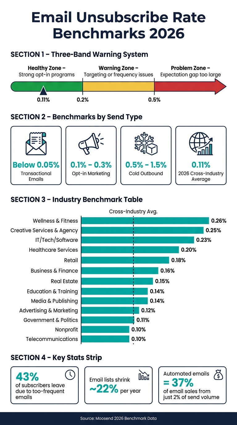
Using delivered emails as the baseline, 2026 unsubscribe benchmarks usually fall into three bands.
Typical ranges by campaign type and industry
Across industries, the 2026 average unsubscribe rate is 0.11%. In North America, it's 0.1%. That sounds simple enough, but this top-line figure can be misleading if you use it without context.
Send type matters just as much as industry.
Transactional emails usually stay below 0.05%. Standard opt-in marketing campaigns tend to land between 0.1% and 0.3%. Cold outbound is a different animal and shouldn't be measured against opt-in marketing at all - it often falls between 0.5% and 1.5%. So if you're judging a newsletter against a cold outreach benchmark, or against a blended average that mixes multiple send types, you're going to get a warped view of performance.
Industry averages also move around quite a bit, so treat the table below as a directional benchmark, not a hard target.
| Industry | 2026 Avg. Unsubscribe Rate |
|---|---|
| Wellness & Fitness | 0.26% |
| Creative Services & Agency | 0.25% |
| IT/Tech/Software | 0.23% |
| Healthcare Services | 0.20% |
| Retail | 0.18% |
| Business & Finance | 0.16% |
| Real Estate | 0.15% |
| Education & Training | 0.14% |
| Media & Publishing | 0.14% |
| Advertising & Marketing | 0.12% |
| Government & Politics | 0.11% |
| Nonprofit | 0.10% |
| Telecommunications | 0.10% |
Source: Moosend 2026 Benchmark Data
Low, acceptable, and high unsubscribe bands explained
A simple three-band model makes it easier to read any campaign result:
- Below 0.2% is the healthy zone. Strong opt-in programs often sit here.
- 0.2% to 0.5% is the warning zone. This usually points to issues with targeting, send frequency, or subscriber expectations.
- Above 0.5% is the problem zone. At that level, the gap between what people expected and what they got is often pretty clear.
High unsubscribe rates don't just hurt campaign results. They can also point to inbox risk. When unsubscribe rates climb, it's often a sign that the content isn't lining up with audience intent, and that can weaken sender trust and inbox placement.
The next section breaks down the main drivers: cadence, segmentation, and targeting.
What drives unsubscribe rates in 2026
Once you know whether your unsubscribe rate is low or high, the next job is figuring out why. In 2026, two things drive most opt-outs: how often you send and whether the message fits the person getting it.
How send frequency and cadence affect opt-outs
Frequency is still the clearest signal in the data. 43% of subscribers say they unsubscribe because brands email them too often.
That said, more email doesn't always mean more unsubscribes. Relevance carries more weight than frequency by itself. A weekly schedule - or any steady rhythm people can get used to - is usually the safest starting point. Long quiet stretches followed by a flood of emails tend to push opt-out risk up.
Unsubscribe rate differences by segment, audience type, and lifecycle stage
Subscribers don't all act the same way. If you treat your whole list like one big audience, unsubscribe rates can climb fast.
Most of the strongest patterns come from mismatch, not just message volume.
New subscribers are the most sensitive to early pressure. Right after signup, 50% of consumers fear getting too many emails. At the other end of the list, inactive and lapsed contacts are a major source of decay. 51% of email professionals call it a major ongoing challenge.
B2B lists wear out faster because people switch jobs and companies combine. 43% of B2B professionals report significant list decay from those shifts.
| Segment | Primary Driver |
|---|---|
| Transactional (receipts, resets) | High utility; recipient expects the message |
| Nonprofit | Mission-driven affinity; high relevance |
| Retail / B2C | Promotional frequency and offer relevance |
| IT / Tech / SaaS | Competitive inbox; frequent product updates |
| Cold Outbound | Low intent; list quality and personalization gaps |
| Inactive / Lapsed contacts | Relevance decay over time |
A practical fix is to segment by recent activity. Split contacts into active (last 90 days), lapsed (90-180 days), and dormant (180+ days). That gives you room to adjust both frequency and message type for each group instead of blasting everyone the same way.
How personalization and targeting affect opt-out rates
Relevance is your best protection against unsubscribes. 71% of marketers report at least a 20% engagement lift when using dynamic, personalized content.
Behavior-based and triggered emails make this easy to see. If the same message goes to everyone - no matter what they've done, bought, or where they are in the lifecycle - the gap between content and context starts showing up in unsubscribe rates.
When opt-outs start rising, those same cracks often show up in deliverability and retention too.
Unsubscribe data and its links to deliverability and retention
When unsubscribe rates become a deliverability problem
When unsubscribe rates stop looking like a one-off blip and start showing up as a pattern, inbox placement and list health usually take a hit. Unsubscribes don't carry the same weight as spam complaints, but repeated opt-outs still weaken sender reputation.
Mailbox providers also read rising unsubscribe activity as an engagement signal. If those spikes keep happening, inbox placement can slip. And this rarely happens in isolation. High unsubscribe rates often show up alongside inactivity and delete-without-reading behavior. Put those signals together, and deliverability tends to move in the wrong direction.
That’s why list hygiene matters. Suppress inactive contacts, and give people a preference center so they can scale back instead of leaving your list altogether. In practice, unsubscribe tracking works as both a deliverability check and a revenue warning.
Retention impact and how teams should act on unsubscribe data
The same unsubscribe spike that hurts inbox placement also shrinks the audience for the lifecycle flows that drive revenue. Every opt-out cuts future reach. That matters most in automated sequences like welcome, abandoned cart, and re-engagement emails, because those programs punch well above their send volume.
Automated emails account for 37% of all email-generated sales while making up only 2% of total send volume. Abandoned cart emails alone can generate up to $3.65 per recipient. So when subscribers drop out of these flows, the impact hits retention directly - not just list size.
The practical move is pretty simple: benchmark unsubscribe rates against current ranges, watch opt-out spikes alongside complaint and inactivity trends to spot list fatigue early, and tie unsubscribe trends directly to retention goals instead of treating them like a standalone metric.
FAQs
How often should I review unsubscribe rate?
Review your unsubscribe rate at least once a week. If you're running high-volume campaigns, check it every day.
It also helps to compare your numbers every quarter against your past performance and current industry standards. That makes it easier to spot gaps and see if anything is drifting in the wrong direction.
If it makes sense for your setup, use your email platform’s reporting tools to automate regular summaries.
What should I check first if unsubscribes spike?
First, make sure you’re measuring this the right way: base your unsubscribe rate on delivered emails only. Keep unsubscribes separate from bounces, and check whether the spike lines up with a certain campaign, date, or audience segment.
Then look at the usual suspects: send frequency, whether the message matched the subject line, and whether bounces or spam complaints went up too. If those numbers climbed at the same time, that can point to broader deliverability or account health problems.
Can a high unsubscribe rate hurt revenue?
Yes. A high unsubscribe rate can hurt revenue because it can damage your sender reputation and make it harder for your emails to reach the inbox.
Once unsubscribe rates climb past the common range of 0.5% to 1.0%, mailbox providers may throttle, filter, or reject your messages. That means fewer emails land in front of subscribers, which can drag down conversions, lower revenue per email, and chip away at long-term retention.